We’re changing things up a little…

You may have noticed that this week a few things have changed here at TRC HQ. We have gone through a change to how we look and we want to explain what this means for our channel.
The essence of what makes The Running Channel who we are hasn’t changed and won’t change. We started back in 2019 in a shed with a passion for running and a small but dedicated team. Since then we have grown hugely – helping runners all around the world to run, improve and repeat. So to reflect where we are as a channel and as a community we have gone through this update. But let us explain…

These three words celebrate our dedication to progress in its simplest form. A powerful, memorable statement that all runners can relate to, regardless of what improvement might mean to them. Whether it’s running to improve mental or physical health, to run more often or more consistently, or to run faster or further, it is our community’s call to arms.

This is our brand (pun intended) new logo. The asterisk marks a symbol of ‘more’. Adding more information, more value, more support to a main text – in this case, your running. The asterisk here embodies what we hope to stand for – support for runners everywhere. It looks to reflect perpetual motion to mirror the act of running itself. And of course another word for an asterisk is a footnote, a foot…note. Get it?

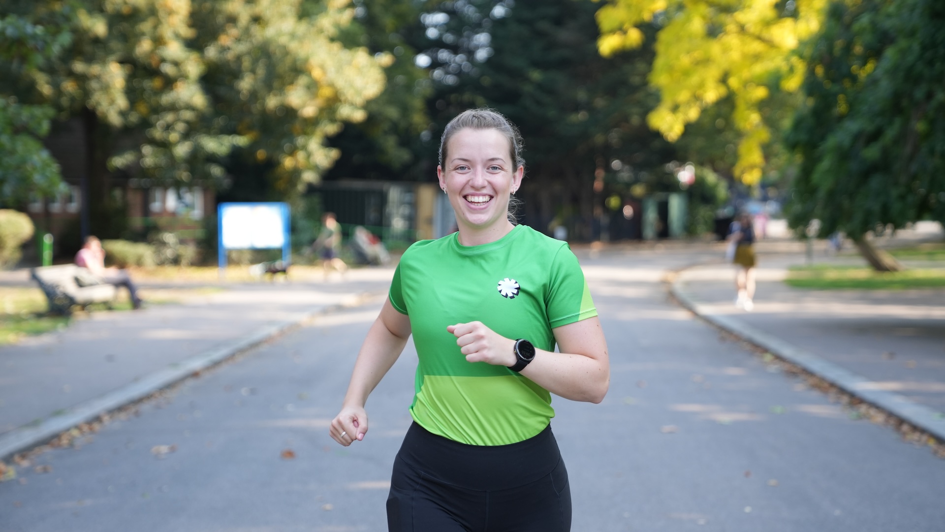
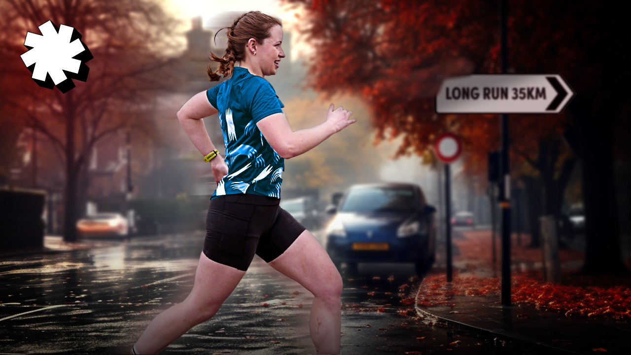
And now to the new colours. We wanted to show up in the community in every way and to reflect the fun side of TRC, so we have gone bold and beautiful with our new kit and colour combinations. You’ll see our presenters wearing new colours and designs and you can also pick them up on our merch store coming soon. The patterns you’ll see are angles taken from our asterisk, tying everything together.
But what do you think? Let us know in the comments down below.


















Running News
Ingebrigtsen Stars at World Athletics Indoor Championships 2025 – Plus All The Winners!
Sam Ruthe Is First 15-Year-Old To Run A Four-Minute Mile!
Eliud Kipchoge Will Run The 2025 Sydney Marathon!